Graphics Design Concepts that Make an Impact

Whether you are selling a product, raising awareness for a charity or simply displaying information it needs to have an impact on the viewer to be successful. The craft of graphic design is crucial here. Creating an impact not only grabs the attention of the viewer it also makes them more likely to remember the critical information.

The displayed information can come in many forms, a television or magazine ad, a brochure, a catalogue, a prospectus, a report, the list goes on. What they have in common is that they need to convey information in a pleasing way that strikes, then retains the viewers attention.

The three concepts of graphic design below all affect how impactful the final piece will be.

Minimalism

The old cliché that less is more has grown a little tired at this point in the history of graphic design. Many designers defy the rule with neo-baroque and similar styles that overload the viewer with a visual opulence.

But function overrules form when it comes to conveying information clearly. Where more elaborate, ornamental styles are used a good graphic designer will contrast or juxtapose them with open clear spaces in which the critical message is printed.

Typically these ornamental elements operate as an extravagant frame around a simple piece of text, enlivening it and drawing attention to what might otherwise be relatively dull information.

Infographics

The infographic is a design technique that often employs minimalism to the greatest effect. It essentially tries to distil a set of data into its most easily digestible visual form.

Infographics have recently become very popular. Through social media, a clever or interesting Infographic can quickly be shared across a wide audience. However, they are far from being a new phenomenon.

Established in Vienna in the 1930’s, Isotype, the international system of typographic picture education was developed to “represent social facts pictorially”. A key motto of the movement was: “To remember simplified pictures is better than to forget accurate figures.” A good graphic designer will keep this motto in mind when creating their infographics.

Typography

Anyone who uses basic word processing software can call themselves a typographer of sorts. However, choosing the right type for a piece of graphic design work requires a keen aesthetic understanding. The typography and the design around it have to work together to make information clear while also drawing the eye with an attractive overall design.

In terms of conveying information clearly font hierarchy is an important aspect of how graphic designers use type. It helps to direct the reader to the critical text, to navigate through different parts of the text and break it up into easily digestible passages.

Text can also be used creatively without having to rely on more abstract designs. Interesting arrangements of text and innovative combinations of fonts can be just as engaging as elaborate illustrations.

The Ultimate Guide to Surviving and Thriving at a Trade Show

Replacement-Graphics_newYour industry trade show is a great opportunity to develop connections, build your client list and ultimately expand your business. However it can be a taxing environment and is unlike any other business event you might attend throughout the rest of the year.


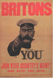
Attending a trade show is also an investment with fees for a stall and the cost of promotional materials. To make the most of this investment and the opportunity a trade show provides you need to not only survive the show but to thrive there.

Be Prepared

The key difference between surviving a trade show and thriving at a trade show is preparation. Flyers, leaflets, pamphlets, guides, brochures, white papers, press releases, banners, stands and displays have to be designed well in advance and ready at least a week before the show.

Ducking out in the middle of the day to print out photocopies doesn’t just look bad it also takes you away from the important work of lead gathering.

Pitch Perfect

Have your sales pitch polished to perfection. The trade show is the most intensive selling environment you will face all year. A constant stream of potential clients will pass you all day long and you need to be able to give each of them the same quality of sales pitch.

Practice in the mirror, practice on friends, practice on colleagues, anyone who will give you two minutes to recite your pitch and fine tune it. Have people quiz you with follow up questions to make sure you have all the important info a client might want, ready to go.

Rest is Best

To get the most out of the limited time you have at a trade show you will need all your strength. This means no early morning, three hour long drives to the exhibition centre then setting up the morning of the show. Get there the day before, set up the day before if you can and be in your hotel bed early.

It might seem like an unnecessary expense of time and money but the extra vitality you will have for bringing in leads will be more than worth it.

Fuel Up

It is going to be a long day. Make sure you can see it through without having to snack at the stand or leave for lunch. A big hearty breakfast should keep you going throughout the day.

Make your Stand Stand Out

You don’t want to be forgotten in the morass of other stands. Think of smart ways you can make your stand different from the rest. Simple things like a prominent colour can make a big difference.

Vibrant colours like pink, orange and yellow can make an impression on clients that have seen nothing but the standard red, white and blue stands all day.

The Final Furlong

The last half of the last day of a trade show is when everyone starts to feel they can slack off. Having been on their feet for days and done more schmoozing more than an automated schmoozing machine, many are happy to go home with the leads they have.

But while everyone else is resting on their laurels you have an opportunity to break from the pack. Have a strategy in place to draw in those weary clients, maybe a refreshment zone in your stall where people can rest for a few minutes and have a coffee or a water. Then, when they are relaxed you can give them the soothing version of your sales pitch.


5 Classic Slogans from Irish Brands

It’s a tried and tested formula and at the end of the day is a simple but incredibly effective way of getting your product on peoples lips and keeping it there. The challenge of course is to find that catchy advertising slogan that people just can’t forget.

Even the smallest brand can take off in a big way with the simplest of slogans. Here we look at a few of the most famous slogans used by Irish brands to keep their products on the tips of our tongues over the years.

Continue reading

11 Great Graphic Design Resources

Stock Images

#1 Flickr – Creative Commons

flickr

A great source of free stock shots supplied by Flickr users. To access these images go to the section entitled “Flickr: Creative Commons” – here you will be able to browse all images with a creative commons license.

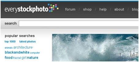
#2 everystockphoto.com

everystockphoto

One of our favourite resources. Log on and sign up for access to millions of free stock images with everystockphoto…it really is as simple as that!

Textures and Patterns

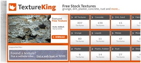
#3 Texture king

texture king
Need a texture for a website, a menu or even a brochure layout? Then here’s your answer! TextureKing is a popular source of free stock imagery featuring textures and backgrounds. The site currently boasts several hundred textures in high resolution.

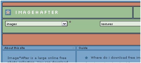
#4 Image*after

iamgeafter
Just like textureking, image*after is a selection of free stock textures and background Images. Files are available for both personal and commercial use.

Brushes & Vectors

#5 Brushking

Brushking
Drive yourself to distraction with the thousands of free Adobe photoshop brushes on Brushking. All are free so you can simply download whatever takes your fancy.

#6 Freevectors.net

freevectors

FreeVectors provides a valuable source of free vector graphics from hundreds of designers. The choice is impressive and all files are available for commercial use.

Icons

#7 Free icons web

freeicons
Free Icons Web contains in excess of 16,000 free vector based design icons – perfect for all manner of graphic, print and website design applications. Some icons are also available in GIF format.

Fonts

#8 dafont

dafont

dafont.com is probably the most popular resource on the web when it comes to all things font related. Fonts are categorised into groupings based on font style. All fonts are free and can be downloaded easily. It’s a file sharing site which allows font designers to upload new fonts which are available for commercial use.

#9 UrbanFonts

urbanfonts
UrbanFonts.com is similar to dafont in that is contains thousands of free to download fonts.

#10 Better Fonts

betterfonts

Better Fonts is yet another free font site with both an alphabetical listing and a categorised listing by font type/style.

File Transfers

#11 WeTransfer

wetransfer

We at Uppercase like the WeTransfer site above all the rest purely because it keeps it simple. There’s no sign up, just enter your email, followed by the email of the intended recipient and attach your file. There’s a 2GB allowance which is loads and that means that most users never need to sign up for the paid for premium service.

Responsive Web Design – What is it?

Technology has changed the way users browse the web. Mobile phone owners want to access the net using their phones, gadget users want to browse the web using their devices. Users expectations have changed because technology never stops evolving. Site owners now scramble to make their pages suitable for mobile browsing because 800 million people now use their gadgets to browse the web. As web browsing jumps into mobile phones and gadgets from the traditional desktops, a new norm in designing websites comes to life – Responsive web design. Continue reading