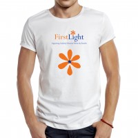
FirstLight Logo Redesign

FirstLight Logo Redesign
A brand revamp for one of our favourite clients (are we allowed say that or “is that racist Ted?”). Upper Case were recently tasked with a redesign of the logo for FirstLight. The brief included the addition of a flower with a missing petal and a flame of light similar to the previous logo design.
Introducing a new colour palette and logo icon helped to add new vibrancy and a softer feel to the existing identity and the existing concept, without necessitating a complete redesign. The flame and the flower were merged to create a logo representing both in a subtle way, considering this sensitive subject.
View our logo and branding portfolio here


