5 Classic Triumphs of Graphic Design

Graphic Design is an incredibly powerful tool. It has developed enormously, particularly over the last century and with specialist graphic design programs, incredible images can be created relatively easily.
However because we are surrounded every day by so many examples of graphic design we often forget just how powerful and compelling it can be. Here we take a quick look at five classic examples of graphic design that have inspired and endured over the years.
I Love New York
The I “heart” NY logo was created way back in 1975 as part of a campaign to promote tourism in New York. Almost 40 years later the logo continues to appear on t-shirts and badges.
The image is almost universally recognisable and is copied in many cities and countries around the world much to the annoyance of New York city who hold a copyright on the image. A classic example of pop-art iconography it perfectly encapsulates the strong emotional bond many have with the city whether they have been there or not.

London Tube Map
Designed by Harry Beck, the London Tube map is not just recognised around the world because it is from the world’s first Underground line in one of the world’s most famous cities. It is also recognised because it is replicated by train networks around the world.
It is replicated because it does the job of transmitting the relevant information incredibly well. It does this in two main ways. As a schematic it does not show the locations of tube stations in a geographically correct position but instead shows them relative to the other stations.
If you are using a tube map you don’t need to know where the stations are located geographically only where they are relative to where you are in the tube system. The other thing it does well is the way it represents the various lines.
Each line is colour coded and the stations marked using dashes or dots depending on whether they are single stations or junctions. These two design approaches make the maps incredibly intuitive to read resulting in very few passengers getting lost.
Apple Logo
Creating a great corporate logo is all about developing instant recognisability. That means keeping it simple and this silhouette of an Apple is about as simple as it gets. But simple in design does not mean simple in effort.
Simple in design means working within limitations while still creating something very pleasing to look at that also conveys a lot of information. The proportions of the curves and their orientation to each other determine how aesthetically pleasing the symbol is to look at.
The bite mark was apparently added so that the symbol would not be confused with a cherry. Interestingly, early designs were monochromatic but Steve Jobs insisted they add colour to humanise it. I wonder what that means now that the symbol has returned to a single colour?

Recycling Symbol
Another great example of simplicity. The symbol is instantly recognisable the world round and very intuitively implies the concept of recycling. Despite being relatively simple it manages to include a number of shapes. While being essentially circular, it forms a triangle on its inner circumference and a hexagon on its outer. The shape forms a moebius strip too.
Whilst starting off simply as a means for paper manufacturers to raise awareness of recycling and to entice a burgeoning environmentalist movement, the symbol has come to represent a powerful ideology particularly in the wake of global environmental issues such as global warming.
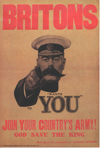
Army Recruitment “Wants You” Poster
This original version of the image is probably not the most famous version. A later American version featuring Uncle Sam pointing at the viewer and a caption reading “I want you for the U.S Army” is probably more widely recognised.
But this is why the original featuring Lord Kitchener, British Secretary of State for War during the first World War, is a graphic design success. It was not popular at the time and not considered to have been particularly impactful on the recruitment effort. However the number of imitations and cultural references it spawned have made it a graphic design classic.
The way the image has been drawn creates a foreshortening effect that makes it appear as if the hand is pointing at the viewer regardless of the angle they view it from.

Image sources:

